DESCRIPTION
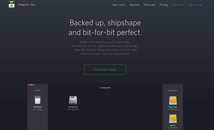
We asked dynamic duo Niek & Patrick to come up with a spiffy design and build of our launching website. Wanting to showcase Hedge\'s main features we chose to feature an animation combined with a a long form website explaining Hedge in depth. Check out the particles in the header. There\'s a modal behind the download button, and the newsletter signup has some nice error-catching UX behind it. Read more about the app on Medium.

