
Article
Animations and graphics are the heartbeat of modern website designs. Without them, some interfaces can feel static or lifeless. When done right, whether it's a simple page transition or a subtle animation, it feels like a connection with the user and the brand. It guides the users smoothly, provides immediate feedback, and injects a new personality into your bland canvas. That's why it is necessary to understand what it takes for a modern, award-winning website to stay ahead of these emerging trends without causing interaction fatigue. Layouts are gradually becoming an integral part of website design; creators transform a collection of visual elements into a cohesive experience and a visually pleasing environment.
Whether it's a pop, a subtle movement, a spin or a fade, animation can make interactions feel more responsive. What you always expected to be a delightful detail is something engaging, intuitive and useful to users that creates an instant connection with your brand. So, if you want to make your project better than the rest, it's important to find when a micro-interaction crosses the line from a really necessary UX guide into pure digital noise.
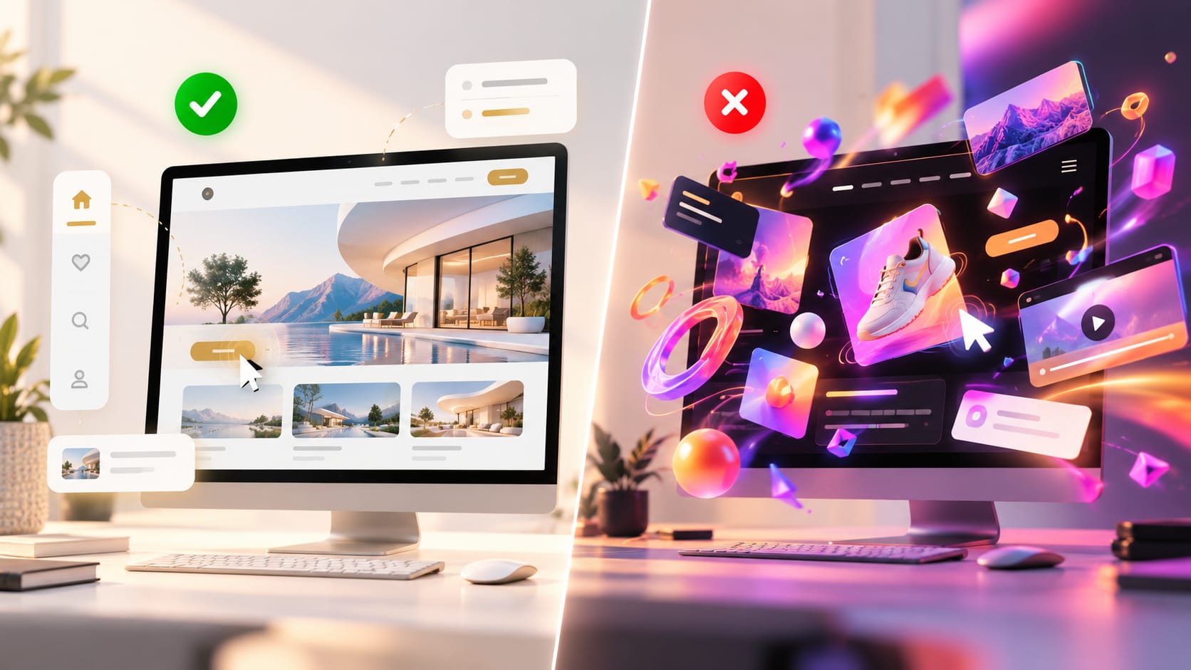
The purpose of motion in UX
You don't have to create something visually creative simply because a trend is popular or an effect looks impressive. While designing a professional website design, every layout element or transition should serve a clear and functional goal. Good motion design works on three main principles— communicating system status, reinforcing visual identity and guiding user interactions. When your potential user interacts with these elements, say a color change, dark mode, or a shift in a button, their interaction confirms their feedback instantly. If these animations do not make the interface easier to use, it's just unnecessary bloat. That's what you can see in any high-profile, award-winning web design. If the functional goals are not met, you can lose the impact.
When animation starts to hurt usability
Micro-interactions can hurt the browsing experience of the users and become pure distractions. They become distracting when they cause cognitive friction and disrupt the flow. The users have a particular goal while browsing your website; it can be finding a product, purchasing, or gaining information. And they will not fight with your layout just to avail your services; users will simply move towards your competitors. For example, if your navigation has a long fade-in animation element every time a user hovers over the menu, you can disrupt their interaction. And the elements keep shifting dynamically; when they aim to click, it can simply cause frustration and abandonment. A good website design helps users along the path and never creates obstacles for them.
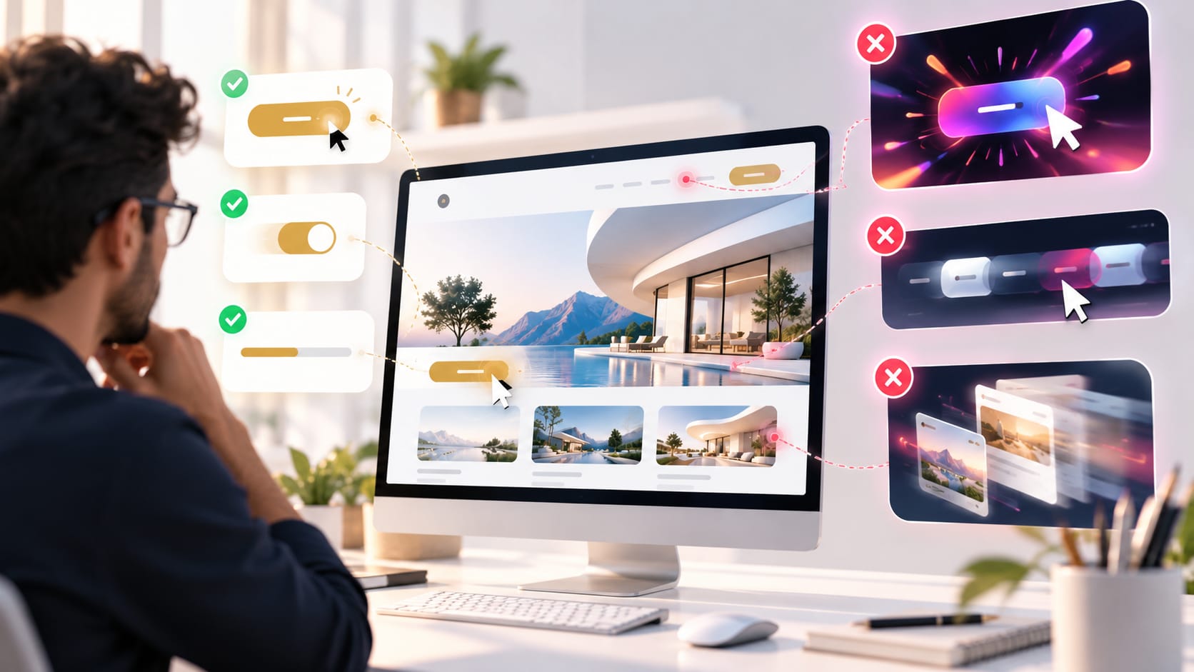
The hidden accessibility threat
If we leave users frustrated and talk about other things, you can say excessive micro-interactions can lead to accessibility barriers. Many cursor-tracking elements, heavy parallax scrolling, and graphics can slow down the page performance. It can be a hassle for individuals with severe motion sickness, vertigo, people with vestibular disorders, and some neurodivergent users who may be sensitive to motion. You need to carefully understand and learn from top digital projects that a massive audience needs a balance between usability and functional visuals. If you want to create an inclusive design, you need to work on user experience without sacrificing human health for the sake of temporary visual trends.
The Golden Rule—Design for Subtlety
Some of the world's best website designs are ones that users barely notice consciously yet feel inherently natural throughout the navigation. You need to maintain a balance between accessibility, clean layout, and lightning-fast speed for everyone by following a strict optimization framework. Some rules you can follow, such as
- Keep it below 300 ms—human minds work flawlessly and can register interface changes instantly. That's why you keep your transition short to ensure maximum responsiveness and the UI feels snappy.
- Honor user preferences—Keep in mind the user preferences while designing a website. Users prefer reduced motion CSS and keep the animation disabled at the operational level to keep the layout clean.
- Test without motion—remove all your animations from initial stages. You don't want to build something that is difficult to navigate or breaks your UX structure.
Conclusion
Hence, animations should not burden users or creators; they should never become the load-bearing pillar of your digital experience. Always remember that an elite award-winning website is based on its performance and built by people who know when to pause. Restrictions and restraint are two powerful elements that can help in creating a functional, award-winning website without overpowering the creative elements. So, don't let micro-interactions become background noise; let them be a powerful connection between you and your users.